Week 7 Page 8: Creating a Color Scheme #2
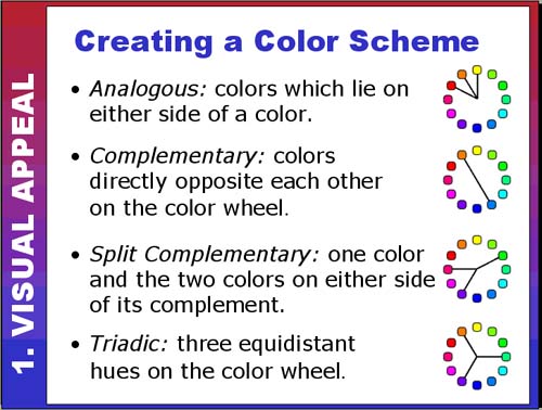
Creating a Color Scheme #2

Now we get to look at how to combine different colors into an appealing color scheme (instead of using just one color with tints or no colors).

analogous schemeAnalogous colors

Analogous colors are very easy to work with because they are close together on the color wheel. Designs that use analogous colors tend to be visually harmonious but may lack dynamism.

If you select an analogous color scheme, make sure there is some contrast in the colors otherwise it might appear that you're accidentally using several variations of the same color.

This site has too many green variations! See how many green variations you can count.

W7p8analogousbad.png


Here's an example of well-handled analogous hues: http://www.spacho.com/ Links to an external site.

W7p8analogousexample.png


. . . . . . . . . . . . . . . . . . . . . . . . . . . . . . . . . . . . . . . . . . . . . . . . . . . . . . . . . . . . . . . . . . . . . . 

complementary color scheme wheelComplementary colors

Complementary colors are opposites on the color wheel and have a tendency to clash at full saturation. They can make for very dynamic and visually exciting designs (if handled correctly!). 

Here's an example of complementary colors (orange/blue) on a web site: http://www.flightoftheconchords.co.nz/ Links to an external site.

complementary web example


. . . . . . . . . . . . . . . . . . . . . . . . . . . . . . . . . . . . . . . . . . . . . . . . . . . . . . . . . . . . . . . . . . . . . . 

split complementary color schemeSplit-complementary colors

Split complementary color schemes still give you a strong color contrast but often with greater harmony (less risk of clashing colors) than straight complements.

Here's an example of split-complementary colors on a web site: http://www.drmartian.com/ Links to an external site.

split complementary web example


. . . . . . . . . . . . . . . . . . . . . . . . . . . . . . . . . . . . . . . . . . . . . . . . . . . . . . . . . . . . . . . . . . . . . . 

triadic color schemeTriadic colors

Triadic color schemes can create balanced yet colorful designs. At full saturation the colors may still compete.

Here's an example of triadic colors: http://2012.hd-live.co.uk/ Links to an external site.

triadic web example

. . . . . . . . . . . . . . . . . . . . . . . . . . . . . . . . . . . . . . . . . . . . . . . . . . . . . . . . . . . . . . . . . . . . . . 

Color Palette Generators

There are quite a few sites that offer inspiration for creating color palettes. To try out your own monochrome, analogous, complementary, split complementary, and triadic color scheme, visit one of the sites below:

Adobe Color (formerly Kuler)

If you need inspiration for selecting colors, visit Adobe Color and see the color palettes shared by other participants. We will be exploring how to create appealing color palettes in more detail next week.

 Go to next page >>