Week 7 Page 7: Creating a Color Scheme
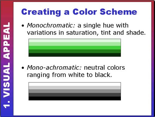 |
Creating a Color SchemeThere are complex technical and aesthetic choices involved in developing a color scheme for a web site. Technical concerns might focus on such issues as web-safe palettes and download speed. Aesthetic questions might address color harmony (Do the colors look good together?) or color meaning/symbolism (What message do the colors communicate about the design?). The slides on the following pages will discuss a variety of different approaches to color schemes. Monochromatic and Mono-achromatic Color SchemesThe first two color schemes are the simplest: monochromatic and mono-achromatic. If you decide to use these color schemes, you have no worries about clashing colors (since both use a single hue) but have a challenge to keep the design visually interesting. Monochromatic Example:
Notice that although the site is predominantly one color with variations in tint and shade, the designer also adds small amounts of other colors for visual interest. Mono-achromatic Example: So why use a mono-achromatic color palette if there are so many wonderful colors to choose from? A mono-achromatic color scheme can be very powerful when combined with one other dynamic color. A mono-achromatic scheme can also help to emphasize any photos used in color in the site using contrast. The following example is almost all black, grey and white except for some color photos that really stand out.
|