Week 7 Page 11: More on Color Relationships
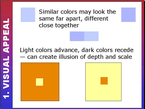 |
Working with similar colorsIf you're working with a limited or monochromatic color palette, be careful with your color choices. Make sure you create enough contrast between the colors that they look sufficiently different when far apart. There's no point in using two different colors if they can be mistaken for the same one! Here's a site that uses several different hues of green (not to mention a splattering of other colors). Can you see how the use of so many similar colors disrupts and confuses the design?
Light/dark relationshipsIn screen design, we are working on a flat surface (monitor) so creating the illusion of depth can add visual interest to a design. One method of creating depth is to use dark and light colors. In the slide below notice the use of light and dark colored shapes to create depth and interest in the background: |