Week 7 Page 12: Avoiding Clashing Colors
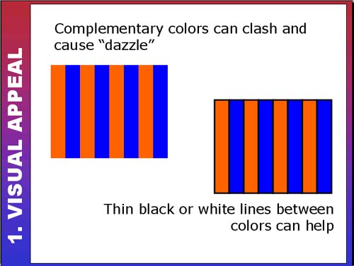 |
Avoiding Complementary Clash!The examples in the slide above demonstrate how designing with complementary (or very saturated) colors can be like playing with fire! Their effects can be either striking or overwhelming. Sometimes using a white, black or grey can offset those dazzling effects. Web Example 1: Bright colors with white
Web Example 2: Bright colors no white...
|