Week 8 Page 6: Using Color to Enhance Understanding
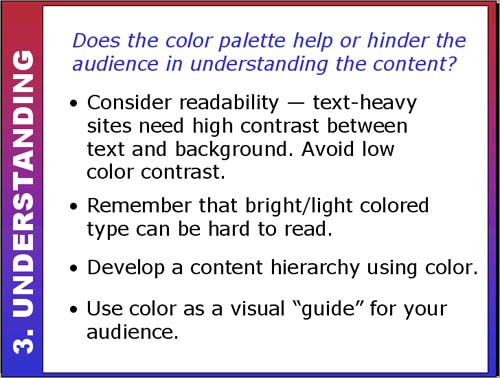 |
Use Color to Enhance Understanding!Color is a great tool for enhancing the content of your site. You can use it for text as long as there is a strong contrast between the text and the background. Even better, use color for subheadings to break up large amounts of text. Be wary of using light or bright colored text since it can be very hard to read. Sometimes black type on a white (or neutral) background is a much better choice! Use color for highlights!! How does the site below do with readability (I have no idea what it's about and, by the way, don't forget your headache pills!). (This is now an archived version -- the current site has gone! What a loss!)
. . . . . . . . . . . . . . . . . . . . . . . . . Color and hierarchyColor is helpful for giving the viewer an "instant" visual understanding of hierarchy (levels of importance) of the content. For example, use one color (or tint/shade) for headings, another for subheadings and a third for text as demonstrated below: Orange for large headings, blue for smaller subheadings, black for text.
. . . . . . . . . . . . . . . . . . . . . . . . . Excessive colorsToo many colors can confuse the viewer and obscure the content hierarchy on the page. Does color help or hinder the hierarchy of this page? Here's an archived version of the page: Craftconn.com Links to an external site. |