Week 10 Page 12: More Web Typography Tips
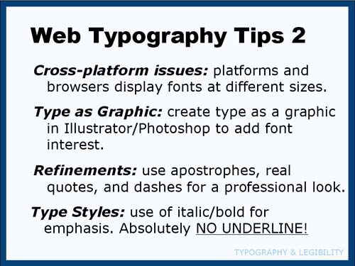 |
Making Your Web Type ProfessionalCreating Type as a GraphicYou want to use your favorite typeface at a specific size in your design... What do you do? The simple answer is to create that type in Photoshop (or equivalent) and save it as an image. Obviously, you won't do this for large amounts of text, but it's certainly an option for headings, buttons etc. In fact, it can vastly improve the visual interest of your page. Just use Photoshop to create the headings for your site, save them as jpeg files and then insert them into the HTML in the correct locations. Of course, this may create problems if your site is viewed on a variety of devices unless your "type" images can shrink responsively in relation to the screen size. If you happen to like browsing for fonts, here's a list of some free font sites you can explore:
Professional-looking Type:If you want to have truly professional-looking type, make sure you use real apostrophes, quote marks and dashes (instead of two hyphens in a row). Here is a site that uses real apostrophes around quotes: There are codes you can put in your HTML to display these characters. In fact, Dreamweaver automatically puts in real quotation marks but still uses "foot marks" for apostrophes. I've noticed that a long dash (em dash—) sometimes does not work in all typefaces on both platforms. If you want your type to look professional, definitely avoid UNDERLINES. They should be reserved to indicate hyperlinks. If you have the urge to create an underline for emphasis... click the BOLD button instead... please?! If you're really keen, here's a very detailed (LONG) article about how to create professional type on the web: |
This ends our discussion of the "technical" aspects of Typography. Now return to the Modules List and read about Creative Typography.